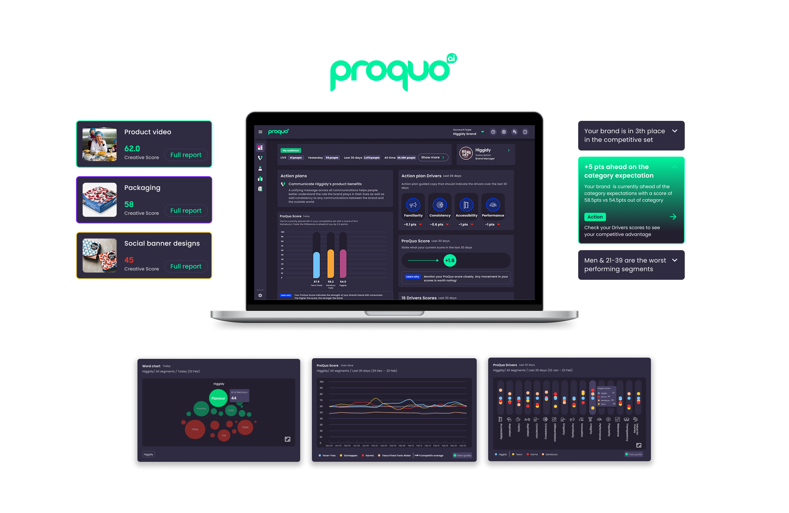
Vixa – From The AA
End-to-end Product design
ProQuo is a B2B Brand tracking tool using data science and behavioural science models to understand a brand's audience and track products, promotions, and competitors.
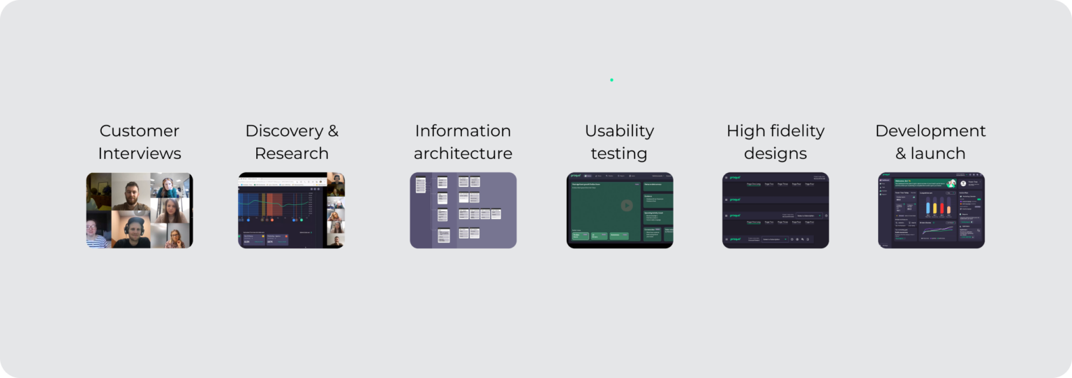
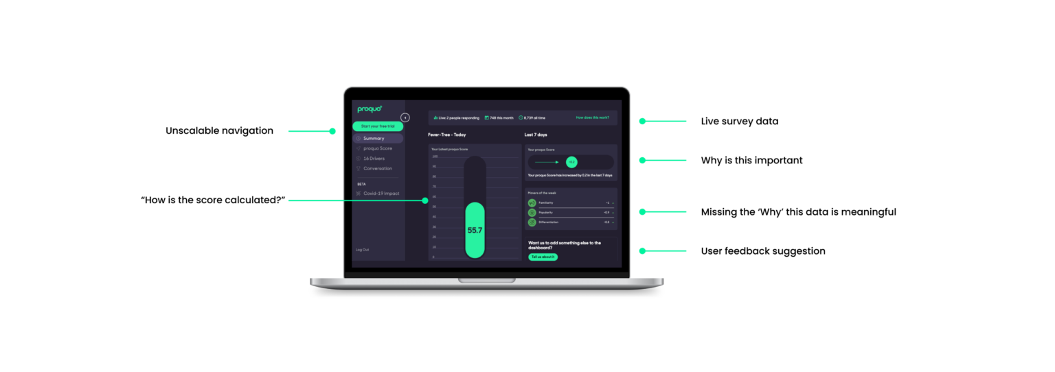
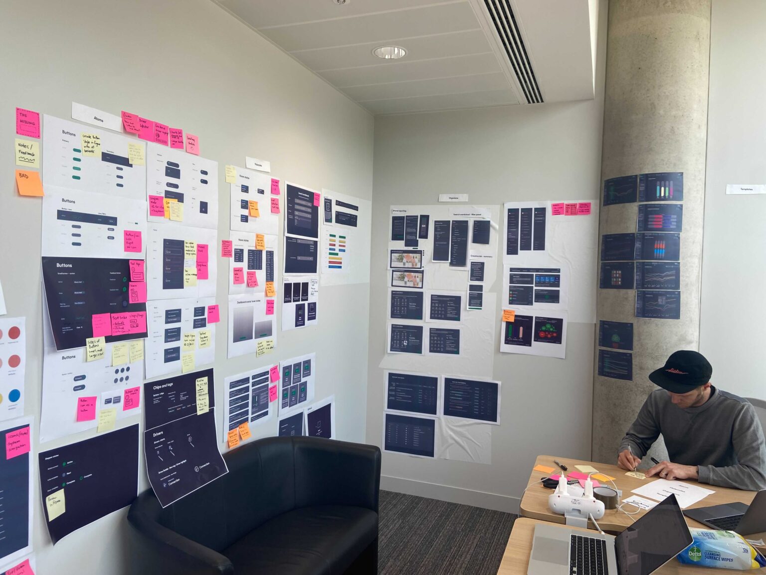
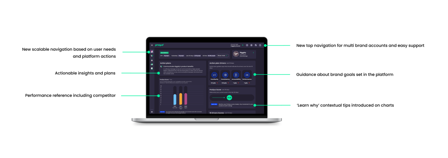
Over two years, I significantly enhanced the product experience by aligning design strategies with business objectives. By understanding the needs of both the customers and customer success/sales teams, I optimised touch-points from initial website interaction to on-boarding and ongoing support in the product.
My design and UX efforts led to a measurable reduction in customer churn, increased customer satisfaction (CSAT), and improved user retention and engagement across the board.
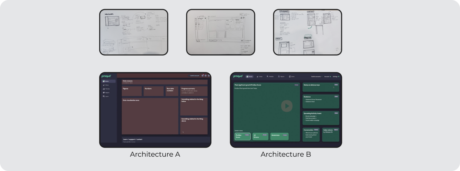
This case study is focussed on the measurable outcomes and demonstrates my process in redesigning a businesses SaaS product.
As ProQuo scaled rapidly, the platform's user experience suffered due to increasing feature complexity. These issues became apparent as customer churn rates increased and customers reported difficulty using the platform without support. Customers told us they faced some of these challenges as reasons for churning in exit interviews: • Complexity of data visualisations; users needed support to understand the data. • Difficult to find the story in the data and take action • Navigating the product took high cognitive load • Naming and language used in the product was confusing • No clear workflows or order to configure the dashboards My role was to validate the customer feedback through UX activities and to organise our efforts to gain business buy-in for adding this work to the product roadmap.
We knew the product had bloated with the development of new features which may have negatively impacted the user experience. As a product group we created some hypothesis to investigate the users UX challenges and create some goals: • Create a new unified app architecture that included repeatable and consistent interfaces • Provide simplified data visualisations that gave control and context to the user
Working with the Head of Product and CPO I devised a strategy to approach the redesign and clean up the products UX
Setting foundations
We began with a systematic audit of every component and element across ProQuo’s product. This gave us a clear picture of our current state and highlighted areas needing attention.
Experience direction
To guide our design evolution, we created mood boards that served both as a structural framework and a foundation for decision-making. This allowed us to consistently validate designs against our intended aesthetic.
Systematic development
I prioritised jobs to be done in a specific order:
1. Audited the existing ProQuo product by printing, cutting out and arranging similar components to define their uses and establish a baseline.
2. Researched best-in-class B2B products and created quick trials to apply our data and content in similar template
3. Prototyped and tested our concepts to gain confidence internally before approaching customers in our testing groups
View the test prototype
I created several high-fidelity prototypes to validate the new structure and navigation, and we tested new labels and language for comprehension. Card sorting exercises, along with 13 customer and internal tests (9 customer interviews and 4 internal team members), revealed clear patterns. The results were: • Increased comprehension of new groupings of content – understood by 100% of participants • Repeating page structure helped user recognition and understanding of data configuration • 10 out of the 13 were able to complete set tasks when asked to find specific information in the new layout
After synthesising the previous testing insights and feedback the next phase was all about a focussed effort to build on the existing platform features, validate the merging of data charts and updated layout.
I planned and executed another round of testing with US and UK customers that were in our "Insiders beta groups" .
The goals were to;
• Understand the if flat structure and single to view charts
• Customer comprehension of their brands position with the new information architecture, patterns and page templates.
These changes enabled customers to easily navigate the platform and complete tasks in just two steps, reducing cognitive load by simplifying chart configuration addressing the customer complaint about previously confusing and hard to reset view chart data. During testing and using Smartlook a testing tracking tool, we observed a 50% decrease in platform viewing minutes 5min - 2.5min. Indicating that users were now able to find information more quickly and efficiently. • Positive customer feedback praising the updates as cleaner and easier to use
With validated prototypes and customer feedback we kicked off the plan for delivering the designs into code.
Working with the CTO and lead front end developer I lead the delivery of design from Figma design in to front end code.
The process from Figma to storybook and into React native and python started.
Using Storybook and React plugins we imported the Proquo design assets from Figma and live product. Referencing the design audit of the existing code base we updated & replaced foundational elements like buttons, forms, colours etc
Next we prioritised the updated navigation and page templates porting in the data charts to a single scroll view with new quick preset buttons with AI curated brand stories.
Over 6 weeks we delivered the full redesign as a stream of work lead by myself and the lead front end engineer.
I lead weekly progress meetings and milestones on delivering incremental value and features. which were shared to senior stakeholders and updated on progress, risks, challenges.
The final designs were delivered 8 weeks later with 2 weeks of testing with our Insiders group by feature flags on accounts to try out the new layout.
• Business value was positively impacted by reduction of calls and emails for help creating reports
• UX benefits –App architecture updates,New pages templates & page navigation meant that the product was far more scalable.
• Now had established rules for new feature additions.
• Clear groupings of data and quick switch from today view and historic view.
feature additions.
• AI guidance and quick filters with export report features
Customer benefit – Value was enabled for self services and easy reporting.
Clear navigation and helpful AI prompts on trends within the data.
Results in numbers:
• Customer churn decreased by 15% over next 4 weeks post launch
• Time spent in the app by customers down 40% as they confirmed exporting data for reporting was simplified
The potential risk was outweighed by the positive results. The success of this project was greatly facilitated by the skill of our engineering leads, who rebuilt the entire app, refactoring old code and improving accessibility, within 8 weeks of our design sprint. Getting early buy-in with the business enabled our small team of multi-disciplined expert to speed through our process. Trust in the team and the process gave us the room to explore and refine at pace.